8 Tips for Mixing Patterns in Your Home Decor
Written by MasterClass
Last updated: Jun 7, 2021 • 3 min read
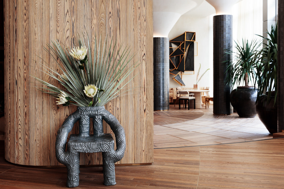
Pattern crosses over many mediums. It can be seen in the veining of marble, the movement of different types of wood, in tile through the creation of geometry, in textiles—the list goes on. The power of pattern lies in its ability to add energy to a room. A patterned fabric can change the scale of a piece of furniture (or the scale of an entire room). How someone experiences the impact of pattern and its relation to other materials in the space is up to the designer—aka you.

Learn From the Best
8 Tips for Mixing Patterns in Interior Design
When you mix patterns, you need the right combination of shape, color, shade, and size to create a harmonic vibe within your living space. The types of patterns you choose will determine the overall feel of your room.
- 1. Incorporate different sizes. When you mix patterns, make sure they’re not all the same size. Use large-scale pattern styles as a dominant pattern, and combine them with medium or smaller scale patterns for accents. For instance, chevron or herringbone patterns are versatile but can be overwhelming in large quantities, so use this pattern on a small scale, like on throw pillows, window treatments, or an area rug to balance out your bigger pattern.
- 2. Use similar colors. Different patterns with different colors can overwhelm a room and make it feel chaotic. Using color schemes within the same tonal family or color palette can create an aesthetically pleasing environment, while still offering variety in its display. You can still accent with bolder colors, but it’s helpful to know the 60-30-10 rule. This means 60 percent of your room should be a dominant color, while 30 percent should be your secondary color, with the last 10 percent as your accent.
- 3. Blend simple and complex patterns together. If you have an intricate pattern you want to splash across your living room or dining room, complement it with a simple pattern that can provide variation and contrast without detracting from the aesthetic.
- 4. Choose a few. Pick three or four patterns to stick with as you develop your room style. Mixing patterns can energize a room, but too many without a throughline may look more like a mess than a visually enhanced style.
- 5. Provide contrast. Staying within your established color palette can help create balance, and so can the varying degrees of light and dark. Using lighter and darker shades of colors can also help certain patterns stand out more, drawing the eye to certain areas of the room, and allowing you to control the narrative.
- 6. Create a visual balance. Mixing and matching patterns and colors can expand your design capabilities, but doing too much can overwhelm the room. Mix in solid colors every so often to break up the lines and shapes of your patterns. Also, keep your patterns flowing throughout the entire room, and not just regulated to one side.
- 7. Careful with prints. Print mixing is also an interior design aspect that needs the right balance. Animal prints can look good with other animal prints (or graphic prints), but too many splashed together can look haphazard. When mixing prints, pair traditional prints with your more eclectic ones to keep a harmonious balance of visual design.
- 8. Know what doesn’t go. While there are a few simple rules for mixed prints and patterns (stripes work well with floral prints and ikat patterns, plaid rarely works with polka dots), they won’t work for every room design—or everyone’s taste. Many times, finding which patterns blend best with others is a matter of trial and error. Find samples you can place together to see if your eyes agree.
Learn More
Learn interior design from award-winning designer Kelly Wearstler. Make any space feel larger, cultivate your own distinct style, and create spaces that tell a story with the MasterClass Annual Membership.


Kelly Wearstler’s 6 Tips for Working With Patterns
Mar 27, 2020

Designer Corey Damen Jenkins’s 5 Tips for Mixing Patterns
Aug 26, 2021

Kelly Wearstler’s 5 Tips for Working With Texture
Apr 3, 2020

Designer Kelly Wearstler’s Most Iconic Interiors
Jan 30, 2021

Kelly Wearstler’s 5 Tips for Creating a Vibe Tray
Apr 3, 2020

Herringbone Pattern: 7 Ways to Use Herringbone in Your Décor
Mar 1, 2022
Other articles
7 Subway Tile Patterns: Ideas for How to Use Subway Tile
Mar 1, 2022
Kelly Wearstler’s 4 Tips for Working With Color
Mar 25, 2020
How to Frame Fabric: 3 Tips for Using Textile Art as Decor
Oct 22, 2021
How to Style Couch Pillows: Throw Pillow Styling Tips
Mar 8, 2022
How to Adjust the Color Temperature of a Room’s Lighting Design
Mar 22, 2020
Gallery Walls: How to Plan Your Gallery Wall for Your Home
Mar 23, 2021