Pastel Colors: How to Use a Pastel Color Palette in Design
Written by MasterClass
Last updated: Aug 12, 2022 • 3 min read
Pastel colors can enhance the vibrancy of bright shades. Learn how to use pastel colors in interior design.
Learn From the Best
What Are Pastel Colors?
Pastel colors are pale variations of primary colors and exhibit lightness and low saturation. To create a pastel shade, blend white into the original color, mixing the pigments until they fully combine. The more white you add to the original color, the lighter the pastel shade becomes. Graphic designers, interior decorators, and artists incorporate pastel colors into their work to blend color palettes, build texture, and balance bold patterns.
5 Examples of Pastel Colors
As tints of primary colors, pastel hues are not on a traditional color wheel. Their limited saturation and pale shades create a soothing and romantic atmosphere. Common shades of pastel colors include:
- 1. Baby blue: Similar to sky blue, baby blue is a light shade of azure that pairs well with pastel yellow and pink. Baby blue is also a signature color scheme for nurseries and children’s rooms.
- 2. Lilac: As a mix between mauve and light blue, lilac is a pale shade of violet that resembles the lilac flower. This pastel color creates a bright contrast alongside shades of olive green and gray.
- 3. Mauve: Like lilac, mauve is also a pastel variety of the color purple. There are different shades of mauve, with some tints containing pale pink hues and others containing light gray shades.
- 4. Mint green: A blend of blue, green, and white, mint green is often a staple shade on a pastel color palette. Different tints of mint green vary according to the proportions of white, blue, and green.
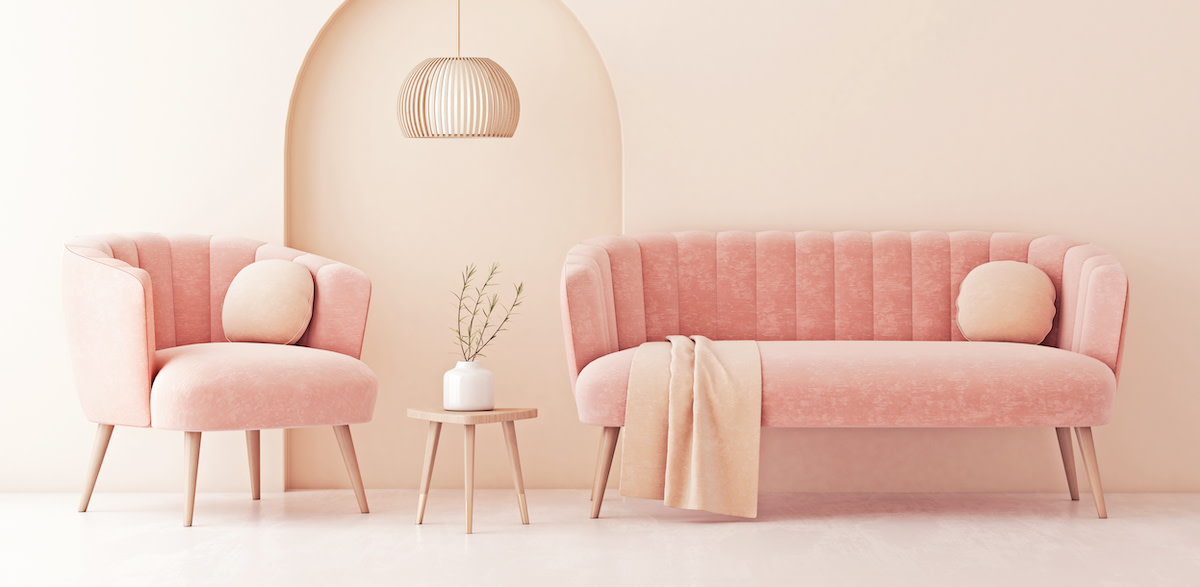
- 5. Peach: A bright summery tone, peach is a pastel color in the orange family. Its warm hues resemble a bright cream, making it an ideal color base upon which to build.
How to Use Pastel Colors
By matching the right colors, you can effectively incorporate pale tones into different design trends. Try these steps for working with pastel colors:
- Create a pastel color scheme. As an arrangement of complementary color combinations, a color scheme is a foundation that balances bright and dark shades. Start by choosing a pastel color as your base. Select complementary colors by pairing this main color with tints on opposite ends on the color wheel. If your color wheel does not include pastel colors, find the primary color closest to your pastel and then note which color is across from it. The pastel version of this second primary color is your complementary color. For example, if pastel blue is your main color, use pastel oranges as your complementary colors in your color scheme.
- Test your shades. Before applying any color to a new space or template, test your color scheme. Pastel colors appear differently depending on how the light hits them. Consider doing a small patch test to ensure you like how the color looks after you apply it.
- Incorporate contrast. Contrasting colors enhance different aspects of your design. Pastel on pastel can result in a faded look the eye has trouble viewing. Instead, layer your pastel background with color contrast. For instance, in a pale yellow web design, consider using a saturated hue for the lettering so the text is eye-catching. Darker tones that pair with pale colors include magenta, eggplant, navy blue, and dark green.
- Add an accent. For a more dramatic look, you can incorporate accent colors in your template. Soft pastels amplify the appearance of bright colors. To make a statement in your design, consider incorporating a primary color shade into your palette. For home décor, use primary color throw pillows as an accent to a pastel-colored couch.
3 Tips for Using Pastel Colors
Consider these styling tips for using pastel colors in graphic design or interior design:
- 1. Add intrigue with metallic shades. Since pastel colors have less saturation, shimmery colors, such as gold and silver, are attention-grabbing against pastel backgrounds. Experiment with different metallic shades to add texture to your pastel look.
- 2. Play with patterns and shapes. Pastel backgrounds are an opportunity to incorporate bold shapes and interesting textures. Consider adding a geometric pattern to a wall with a pastel color scheme. The soft gradient of the pale colors allows the unique shapes to stand out.
- 3. Use neutrals for balance. Adding a pale hue to a neutral color palette creates a fresh, eye-catching look. Neutral colors, such as white, gray, and beige, ground pastel shades and prevent an overwhelming blend of color. This technique works well for business cards and logo designs.
Ready to Tap Into Your Artistic Abilities?
Grab the MasterClass Annual Membership and plumb the depths of your creativity with the help of stage designer Es Devlin, modern artist Jeff Koons, and abstract artist Futura. Our exclusive video lessons will teach you to do things like utilize color and scale, explore the beauty in everyday objects, and so much more.
