Blackletter Typeface Guide: 6 Blackletter Fonts
Written by MasterClass
Last updated: Jun 7, 2021 • 3 min read
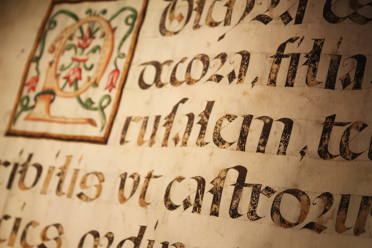
Blackletter typefaces are stylized fonts with a calligraphic appearance and stylized flourishes giving them a distinctly historical feel.
Learn From the Best
What Is the Blackletter Typeface?
Blackletter typeface (also known as Gothic or Old English typefaces) is a family of fonts that are inspired by the dark, saturated calligraphic letters of the Middle Ages. Both the uppercase and lowercase letters are defined by dramatic strokes and elaborate serif swirls. Blackletter typefaces have older letterforms that are highly stylized and dense but still legible, though they are typically used as flashy display fonts rather than small text or long body copy.
A Brief History of Blackletter Typeface
In typography history, blackletter first emerged as a type of handwriting script in the Middle Ages, which became the basis for early pioneers of type foundries. It developed after paper replaced parchment as the common writing medium, which made for a smoother writing experience, and the evolution of the cursive script.
In the fifteenth century, Johannes Gutenberg used his printing press to print a copy of the bible in blackletter type. This typeface had a formal appearance partly due to pens being held at a 45-degree angle. During the Italian Renaissance, blackletter was considered a Gothic font style as the evolutionists of the humanist type deemed it barbaric. Today, blackletter is still used as the nameplate typeface for a number of newspaper publications.
3 Characteristics of Blackletter Fonts
Here is an overview of some of the characteristics that Blackletter typefaces share in common.
- 1. Stylized: Lettering in blackletter typefaces has a highly stylized appearance rooted in medieval, classic calligraphy. The letterforms are often dense with flourishing ascenders and caps.
- 2. Contrasting strokes: Blackletter letterforms are typically characterized by angled strokes that mimic calligraphic handwriting, creating a sharp contrast between thick and thin strokes.
- 3. Serifs: Most blackletter fonts have serifs, the small flourishes on the end of their strokes, that loop elaborately and contribute to their stylized appearance.
6 Blackletter Font Families
There are many different styles of blackletter type that can be used for decorative or eye-catching purposes. Here are common blackletter font families.
- 1. Textura: Textura is the most calligraphic form of blackletter type, sometimes referred to as Gothic Bookhand or textualis. It was used most commonly in western Europe in places like Germany, France, and Italy. This form of blackletter type has a taller and more narrow structure, with short vertical strokes and no connection between the letters.
- 2. Fraktur: Fraktur became the most common blackletter type style in the 1500s, so much so that Fraktur is sometimes synonymous with blackletter type and remained popular up until the twentieth century. Fraktur letters have more rounded or curved shapes to them and appear highly stylized.
- 3. Rotunda: Rotunda letterforms are characterized by round characters, unlike the angular ones seen more commonly in northern European printing. These letters were considered easier to read than the previous Roman type with a less rigid structure.
- 4. Schwabacher: Schwabacher was influenced by Rotunda letterforms featuring rounder and smaller characters, similar to the look of hand lettering seen in calligraphy.
- 5. Cursiva: Cursiva refers to simplified blackletter characters that resemble the swirled flourish of cursive writing. It came into practice when writers transferred from parchment to paper. This font is often characterized by deep descenders, and curved ascenders rather than vertical ones.
- 6. Bastarda: Bastarda is a hybrid of Textura and Cursiva that was mainly popular between the fourteenth and sixteenth century. This blackletter script contains elements of both type styles, with the strong lines of Textura blended with the looser, more relaxed structure of Cursiva.
Want to Learn More About Tapping Into Your Graphic Design Genius?
Get a MasterClass Annual Membership and let David Carson be your personal tutor. The prolific and decorated designer—who’s been lauded as the “art director of the era”—reveals his processes for going off the (design) grid, implementing typography in new and interesting ways, innovative uses of photography and collage, and so much more.
